

Redesigning Parkinson’s UK event pages (Pedal for Parkinsons) to improve making the experience more inclusive, accessible, and confidence-building from sign-up through to fundraising and event day.
My Role: UX/UI Designer
Published: 2025
Team: UX Designer (myself), Senior UX Designer, Product Managers, Software Engineers, Content, Brand
Tools Used:

Overview (approx 5 minute read)
What is Pedal?
Pedal for Parkinson’s is a charity cycling event by Parkinson’s UK — open to anyone wanting to raise money through a day on the saddle. My role was to redesign four key event pages, helping people of all backgrounds and confidence levels sign up, understand what to expect, and feel supported from start to finish.

The Goal
To redesign the Pedal event experience with accessibility, clarity, and user engagement front and centre. We needed to strike a balance: support experienced cyclists and reassure those new to fundraising or unsure of what to expect.
Redesign Goals:
🚴 Rebrand the Experience
Make Pedal feel like a proper cycling challenge — not just another donation ask.
📢 Surface Key Info
Help users quickly find what matters: route, cost, and on-the-day support.
💰 Boost Fundraising Confidence
Make targets like £150–£250 feel doable, with tips, examples, and impact stories.
📈 Support Strategic Goals
Improve sign-ups and income, while lifting the overall experience.
Key Improvements

Smarter Information Hierarchy
I used previous research and card sorting to reprioritise what users see — surfacing essentials sooner.

Better Mobile Experience
Added Apple Pay/Google Pay support for quicker, simpler sign-up on the go.

Easier scanning
Broke up content using clear sections, imagery, bullet points, and cards — helping users stay engaged.

Inclusive Messaging
Shifted the tone to celebrate all fundraisers — not just top earners — creating a more welcoming vibe.

Accessibility by Design
Shorter scrolls, clearer labels, and a reduced cognitive load, even for users with Parkinson’s or fatigue.

New Branding
Applied the new branding to give the Pedal for Parkinson’s page a bold, energetic feel, exploring how to use the updated patterns effectively.
The Scope
We focused on improving four core event pages:
Event pages

Training Hub

Fundraising Hub
Series page

— designing a more responsive, accessible experience using the updated brand guidelines.

What we did:

What we didn’t:
The Problem
We knew the pages weren’t originally designed by UX specialists, and the branding/marketing team needed support translating the content into a user-friendly, accessible experience. This led to a few core issues:
📃 Content Overload
Dense, hard-to-scan content — not ideal for users with cognitive strain, fatigue, or tremors.
💸 Fundraising Hesitancy
Some users felt unsure about targets — and the site wasn’t helping build their confidence.
👥 Limited Accessibility
Most past participants didn’t have Parkinson’s, so inclusive design hadn’t been a priority (yet).
🧭 Hidden Essentials
Important details like the jersey, route map, and support info were buried or unclear.
My Role
I joined the project during the redesign phase and worked closely with the content, brand, and digital teams to create a more user-friendly and accessible experience.
🎨 UX & Content Design
Turned insights into cleaner, more structured pages that supported different user types.
🤝 Cross-Team Collaboration
Worked with Brand and Fundraising to ensure the designs were engaging and functional.
🌱 Accessibility Advocacy
Even though most users didn’t have Parkinson’s, I pushed for design decisions that future-proof the experience — building inclusivity from the ground up.
⚙️ LEAN Workflow
With a tight deadline and partially defined requirements, we used a LEAN thinking approach — focusing on quick cycles of design, feedback, and refinement to deliver high-impact work efficiently.
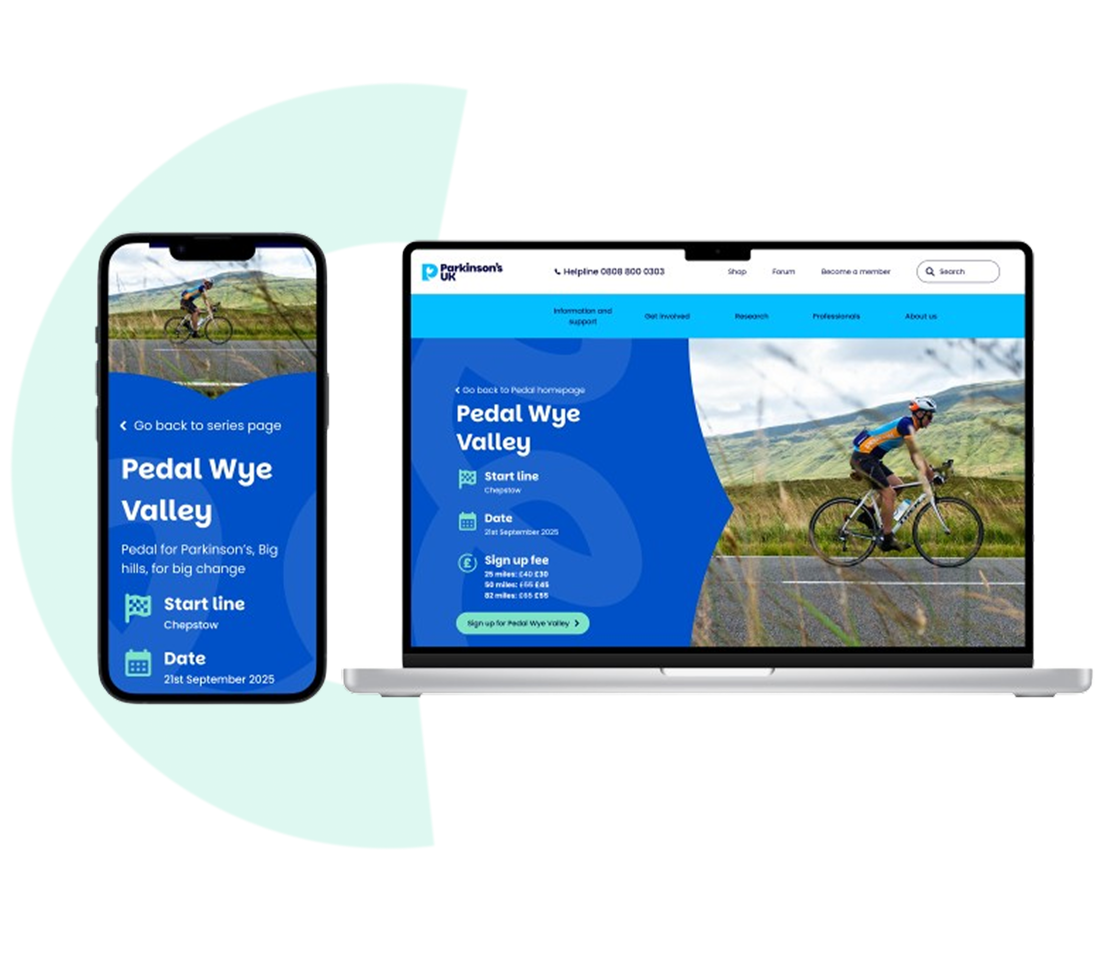
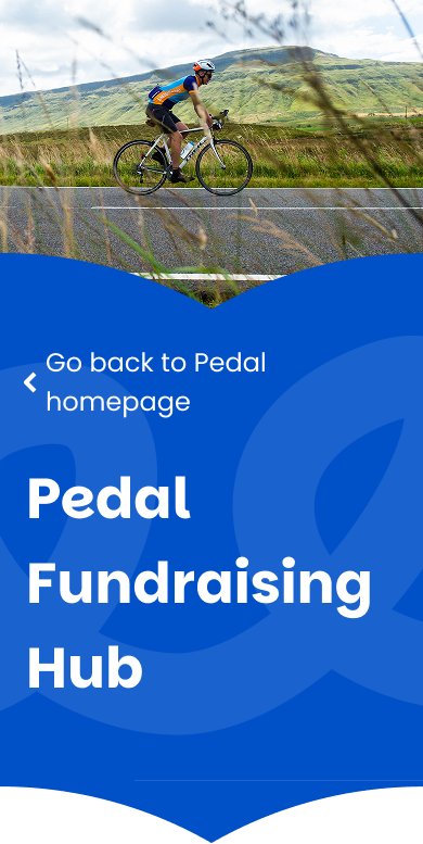
Final Design
Before redesign

After redesign

Full Case Study (approx 10 minute read)
🚴♀️ What is Pedal?
Pedal for Parkinson’s is a cycling challenge that raises money to support people affected by Parkinson’s. For 2025, I focused on redesigning the event pages — making the experience more inclusive, accessible, and confidence-building from sign-up through to fundraising and event day.
This was the first time the pages had been approached with a UX and accessibility lens, and my role centred on turning research into a streamlined, motivating experience for a broader group of users.
Discovery: Understanding the Pedal Experience
Before diving into design, we took a step back and listened. We ran one-to-one interviews to better understand what people valued about Pedal — what was working, where they felt stuck, and what might encourage more people to get involved.
Our group included both cyclists and people with a personal connection to Parkinson’s. While small, the group reflected the kinds of people who typically take part — and the insights were key to shaping a more thoughtful digital journey.
Because we were working to a tight deadline with partially defined requirements, we followed a LEAN thinking approach: learn quickly, act fast, and adapt based on feedback. This mindset helped us stay focused on real user needs, prioritise the essentials, and move forward without over-planning.
👥 Who we spoke to
7 participants (5 men, 2 women), aged 25–74
2 were living with Parkinson’s
All had a link to cycling — ranging from weekend riders to more experienced cyclists
🧠 What We Learned
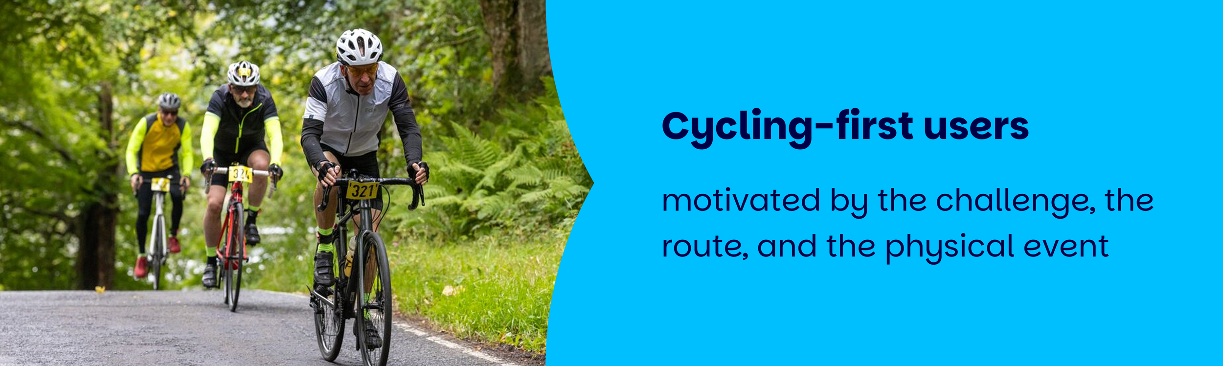
From these sessions, two clear participant types emerged:

We also learned:
Social features (like Strava groups and team fundraising totals) helped build community and motivation
Practical info like route details, tech support, and logistics were deal-breakers — people needed to know exactly what they were signing up for
Personal connection to the cause was a major motivator, though donor fatigue was something some users worried about
Location, timing, and travel distance played a big part in whether someone registered or not
As part of the problem-solving process, I reviewed a provided persona and identified that it didn’t fully address key user needs — including reassurance for fundraising newcomers, the importance of practical logistics like route and support information, and inclusive language for people with Parkinson’s. I noted these gaps to ensure they were considered in the next stages of the project.

User persona - made by the product manager
The redesign wasn’t just about making things look better - it was about building an experience that supported users at every stage:
⚖️ Balance was key
Clear, practical info needed to sit alongside emotional storytelling about the cause
🤝 Support for newcomers
We simplified language and structure to reduce overwhelm and build confidence
♿ Accessibility first
We aimed for a cleaner experience that worked for people with Parkinson’s as well as casual mobile users, with Apple/Google Pay support and clearer sign-up flows
🔄 Inclusive fundraising
Instead of just celebrating top fundraisers, we suggested ways to recognise everyone’s efforts
We used a range of UX research methods to build a clearer picture of user needs:
-

User Interviews
With people at different stages of their fundraising and cycling journeys
-

Market Analysis
Looking at other charity cycling events to spot gaps and opportunities
-

Card Sorting
To prioritise content and restructure the page layout around user expectations
-

Usability Testing
We tested early versions of the sign-up flow with both seasoned cyclists and total newcomers to check for blockers (and we’re planning more testing in future!)
-

Surveys
To recruit participants and capture broader insights around motivation and confidence
At the start of the project, the Product Manager provided a detailed market analysis, highlighting features and approaches from other charity and event websites that could inspire our redesign. Alongside this, they shared a set of user assumptions (both untested and previously validated) as well as a proposed information architecture — giving us a solid foundation to build from and ensuring we were aligned on user needs and expectations from day one.

Market analysis

Assumptions

Information architecture

Validate assumptions
Why redesign now?
While Pedal had been performing well, 2024 saw a dip in activation rate — and feedback pointed to some friction in the user journey. The event was popular, but the digital experience needed to better support people from first click to fundraising success.
We saw a clear opportunity to simplify the experience, reduce barriers, and help more people feel ready and excited to take part.
2025 targets

How we’ll measure success:
-

Funraisin platform data
Including sign-ups, jersey unlocks, and donation behaviour
-

Google Analytics
To track drop-off points and key actions like clicking route maps
-

Qualitative feedback
With follow-up interviews post-event to keep learning and improving
Define & Develop
This project marked a big shift from previous years — it was the first time the Pedal fundraising pages were designed with accessibility and UX principles at the forefront.
In the past, the pages had largely been shaped by branding and marketing needs. While they served their purpose, they hadn’t been through a UX design process before — so this was an opportunity to create a more user-friendly, accessible experience that considered real user journeys from start to finish.
The current pages & user journeys

Some pages felt unnecessary — adding extra clicks and links that pulled users away from the main journey.
We needed to rethink how to present this information more efficiently, consolidating it without relying on separate pages.
Research-driven from the start
This was also the first time Pedal had invested in meaningful user research.
We kicked things off with in-depth interviews — learning directly from potential participants what motivated them, what confused them, and what made them hesitate. These insights became the foundation of the redesign.
Because we already had a well-defined information architecture, it didn’t feel appropriate to create user flows — the structure was already so detailed that we were able to move straight into high-fidelity design.

Parkinson’s UK typeface
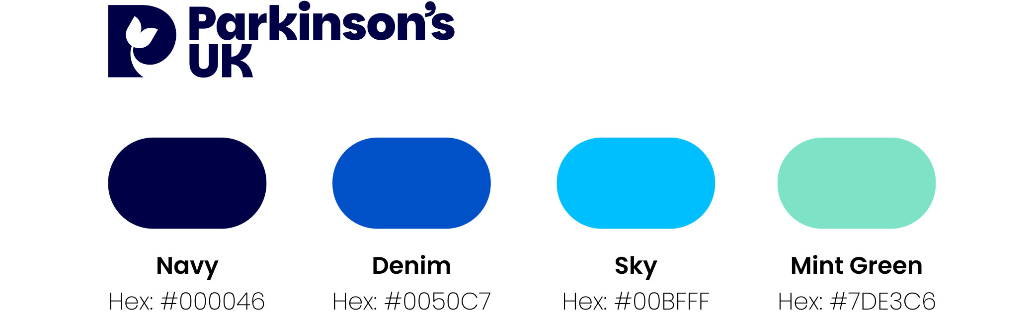
Pedal event colour palette
Exploring multiple layout pathways
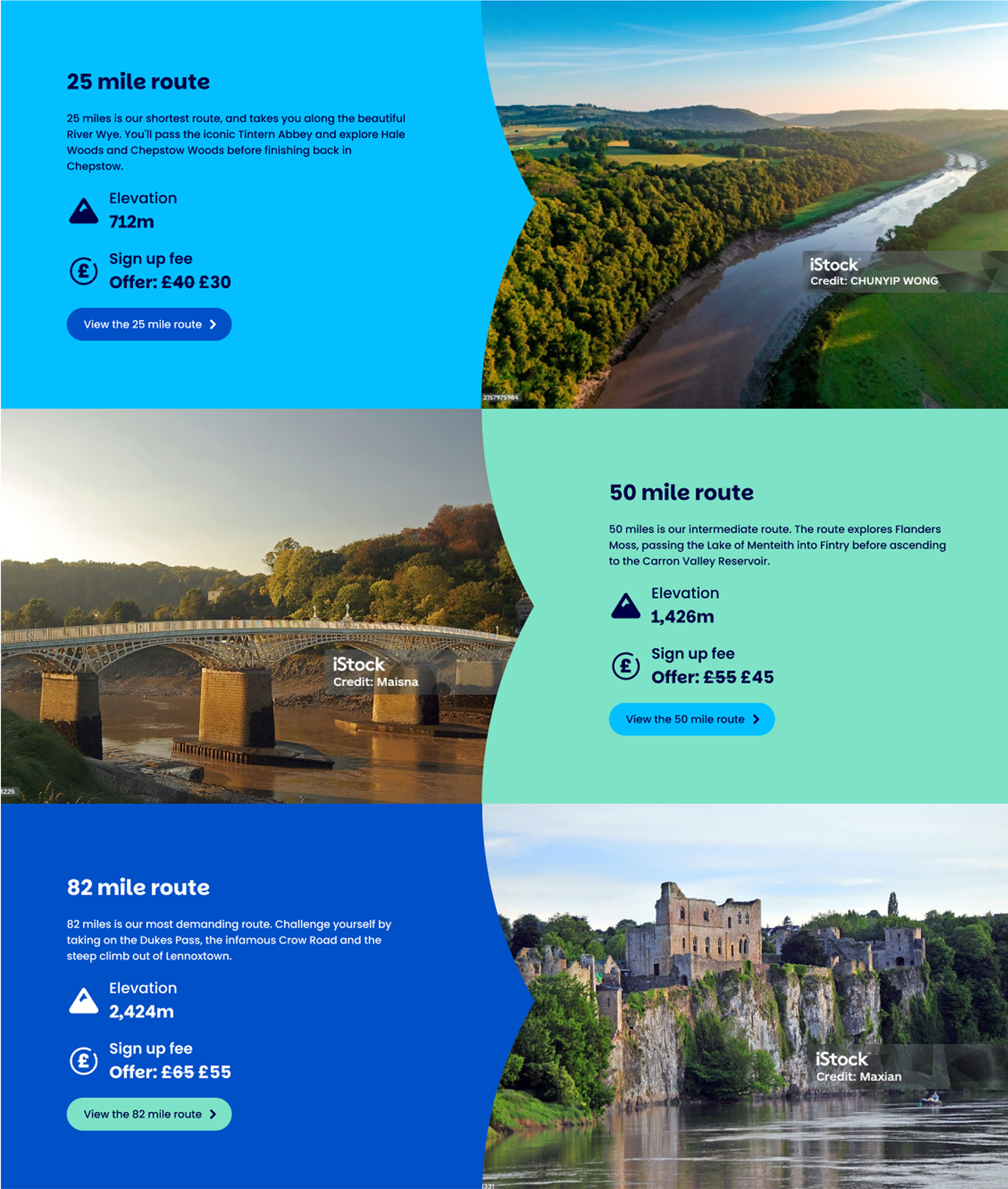
To help the team see different possibilities, and show that we were thinking beyond just delivering what was briefed — we created three distinct layout options for the event pages:


⚠️ However, this wasn’t without its challenges.
There was some healthy debate — particularly around the squiggle sitting behind key text, which I flagged as a readability issue, especially for users with visual impairments. Through collaboration with the brand team, we found a compromise: lowering the opacity from 20% to 10%, which meant we could retain the brand expression without compromising accessibility.
Playing with Patterns
We explored a range of design concepts using arrow patterns and the branded squiggle. Below are desktop versions featuring both elements, which we later shared with the Branding team for feedback.


⚠️ Stakeholder Pushback on Arrows vs Blocks
While the design team were excited about the arrow-led journey, not everyone was convinced straight away.
Some stakeholders preferred the safer, more traditional blocky layout — feeling it was more aligned with the updated brand guidelines and less visually disruptive.
We made the case for the arrow concept by grounding our argument in both user data and insights:

We also backed this up with feedback from early design reviews and stakeholder sessions, where comments included:

These insights helped us demonstrate that the arrow design didn’t just look different — it supported user behaviours and added a distinct visual identity for Pedal, helping it stand apart from other fundraising pages like Walk for Parkinson’s.
In the end, this helped us gain alignment and move forward with a design that balanced brand needs with an evidence-based, user-centred approach.

⚠️ Early Stakeholder Feedback: Visually Busy Pages
While stakeholders liked the energy and flow of the arrow-led layout, some felt the pages were starting to feel a bit too busy and pattern-heavy, especially on first glance.
That’s when we realised what was missing — imagery!
Once we brought in carefully placed photos, the entire page began to feel more balanced. The imagery helped break up the content naturally and gave the pages more breathing space, while still keeping the arrow-led journey intact.
This turned out to be the key turning point.
Once the imagery was incorporated, the feedback shifted — stakeholders agreed this approach gave Pedal its own unique identity, felt dynamic without being overwhelming, and struck the right balance between brand, fundraising, and user needs.

🚨 Accessibility vs Brand — The Squiggle Debate
Another point of discussion was the branding team’s desire to include a decorative squiggle behind key text — a standard brand element typically applied at 20% opacity.
From an accessibility standpoint, I flagged that even at 20%, the squiggle risked making text harder to read, particularly for users with visual impairments or cognitive challenges.
This sparked a bit of back and forth — but by demonstrating the impact on readability, we found a compromise:
We lowered the opacity to 10%, allowing the squiggle to still feel present and on-brand, but without compromising the clarity and legibility of the text.
It was a good example of balancing brand consistency with accessibility best practice, and showing that small adjustments can make a big difference.
Below are the Final Mockup Designs for the:
Series page, Fundraising hub, Training hub and Event page.

Video of Mobile prototype of the Series Pedal Page
Video of Desktop prototype of the Series Pedal Page
Last-minute content curveball…
Just as we were finalising the mock-ups, the team introduced new campaign messaging that needed to be slotted in.
Because we’d worked with reusable components from the start, it was relatively easy to reflow the content — but it was a good reminder of how important flexibility is in fast-moving projects.
Designing with developers in mind
At this stage, we had moved into the Realist phase of the Disney Creative Method — a model we used throughout the project to guide our thinking. This phase is all about bringing ideas to life in a practical, feasible way — turning creative concepts into reality.
Although we were already deep into this delivery-focused phase, we made a conscious effort to ensure our designs were not only visually engaging but also efficient and straightforward for developers to build.
For example, the arrow element — which introduced a sense of movement and flow through the page — were carefully designed with performance and simplicity in mind.
We used reusable SVG assets in such a way that developers could easily apply them during development using :before and :after pseudo-elements.
This approach helped us balance creative ambition with technical feasibility, ensuring the pages not only looked great but also performed well and would be easy to maintain going forward.
Our key recommendations
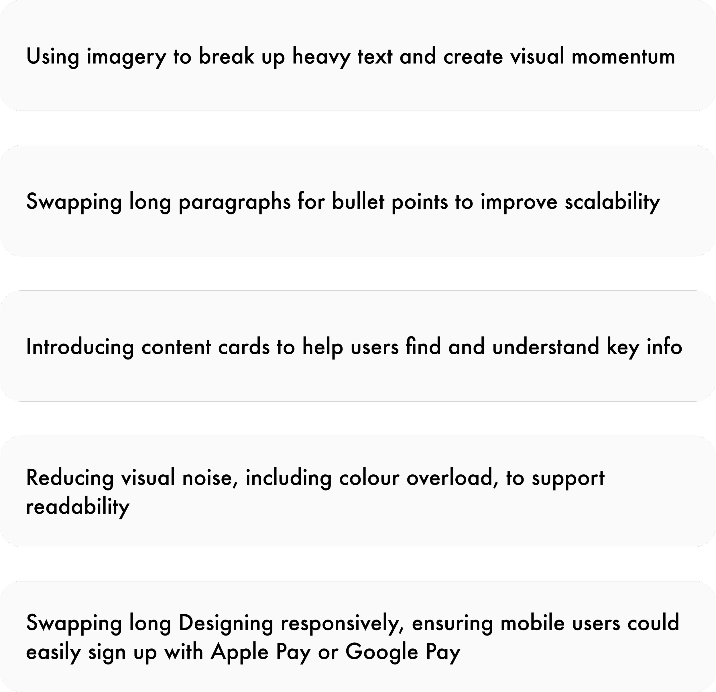
To create a cycling-first, accessible experience, we suggested:
This phase laid a strong foundation for future iterations - and set a new standard for designing Pedal pages that feel inclusive, exciting, and easy to navigate.
Outcome and next steps
The redesigned Pedal for Parkinson’s journey went LIVE in 2025 — a big milestone for the team and the cause.
Although usability testing wasn’t part of the initial scope, plans are in place to test the new pages in the future. This will help build an even more evidence-based, user-focused experience over time.
Next steps include:
Ongoing refinement based on user feedback and analytics
Tracking engagement to ensure Pedal continues to meet evolving user needs
The project doesn’t end at launch — it’s the beginning of a more inclusive, engaging journey for everyone taking part.